SPS exhibition by John Lynch
Places we go, Places we don’t, People Who Dream and People who won’t
The woodcuts on display have all been developed and produced as a result of the one year Peter Reddick / Lark Trust Bursary programme at Spike Print Studio. The bursary is for the development of a contemporary practice in the field of relief printmaking. From 2012-2013 the award went to John Joseph Lynch on the strength of his Masters Portfolio and bold ideas.
Throughout the period of the bursary J J Lynch developed a practice in woodcut printmaking, which he had no previous experience of, and along the way has developed a high standard and understanding of.
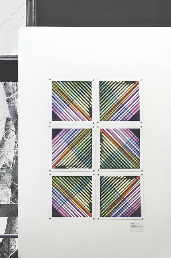
A love for the skills and techniques used in traditional Japanese woodblock printmaking completed a departure from the heavy layers seen in his earlier reduction prints and the use of lino. Lynch’s work has ventured into a new luminous and transparent pallet and the use of four colour separation and exclusivity to woodcut printmaking. Works such as Mode, Royal Mail and Demolition use a different block for black, yellow, red and blue to create the highly saturated and versatile colour seen in the new works.
This use of colour reflects Lynch’s love for print as an art form that maintains a direct relationship to media representations – magazines, adverts, newspapers, TV and film – all printed and produced with processed colour. As always the context of Lynch’s works forms a close relationship to the methods and techniques used.
J J Lynch’s work orientates around the iconic in a contemporary media driven society. Often the work is about a combination of traditional icon systems combined with contemporary mass media. His work also reflect time, history and decay.
The prints Criminal + host a collaged face made from four familiar US presidents; this face becomes a hauntingly familiar fictitious figure. Pitched with a wicked sense of humour these works, in various colour co-ordinations, comment on the use of the face or a figurehead that is formulated to promote systems of belief.
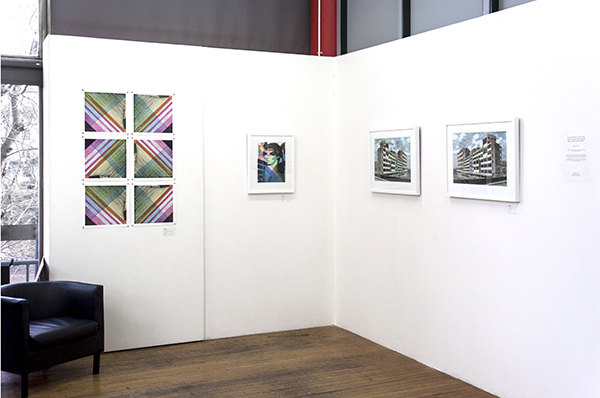
Lynch’s work doesn’t just propose the face or the idea of a person emerged from a higher power as iconic. In Royal Mail :V1 and V2 an old postal centre is used to convey a different meaning to the theme of iconic. In these prints the empty shell of a disused business centre for the Royal Mail is used as a reflection to a number of contemporary issues such as economic decay, limbo between states of being, and the state of ruin. The representations of ruin are also reflected in the highly saturated mini prints Demolition, which take the image of a building during demolition and reflect images seen from shanty towns, war torn streets or natural disasters.

The work on display is largely created within the last six months and every block is painstakingly hand carved. These new woodcuts are a clear move in a new direction for Lynch which have come about as a result of an intense scrutiny on woodblock printing during the Spike Print Studio Bursary. He now plans to spend much more time looking into these intense colour ways and architectural monuments in a state of ruin. His love for the planes and dreamscapes produced by harsh concrete structures, and the hidden beauty and poetry in them continues to be a source of inspiration.